What Rock Climbing Taught Me About UX Design
Over the past year, climbing and UX design have oddly started to blur together in my brain. Both are about navigating problems, facing fears, and making decisions with limited information, ideally without falling to your death (or rage quitting).

Why Your App Shouldn’t Feel Like a Slippery Slab on Wet Granite
Introduction
Last year at the ripe young age of fifty....something something, while most of my contemporaries were settling in to their routines of golf, tennis and, dare I say it, pickleball, I embarked on a different kind of journey. I took up rock climbing. Who says an old dog can't learn new tricks?
This journey started simply as a gym exercise. A nice way to socialize and build some core and upper body strength in the process. Except for one thing - Katie. Katie is my girlfriend and Katie likes to, no she HAS to, climb outside when the weather permits and last December while we were visiting San Diego, the weather permitted.
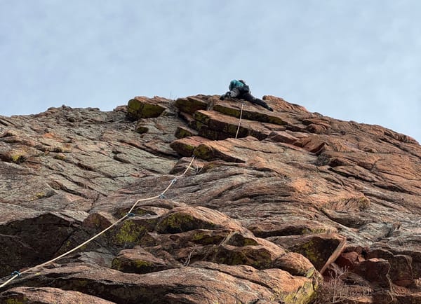
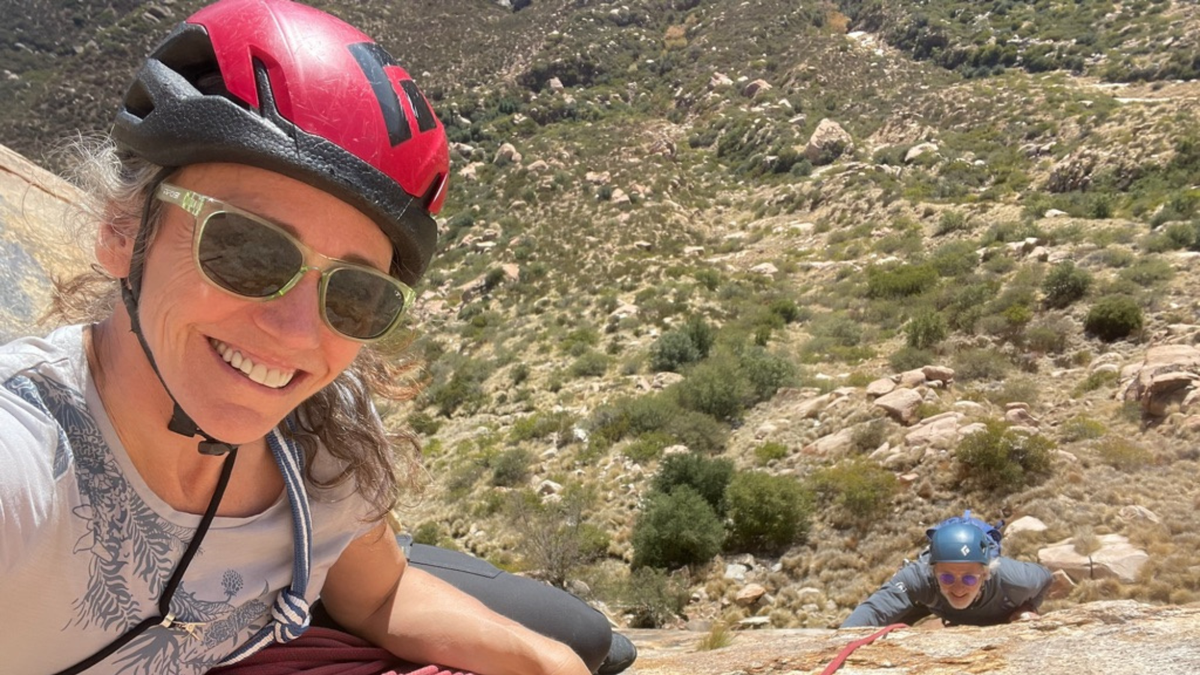
Katie planned a special holiday treat for me, my first multi-pitch climbing adventure at El Cajon mountain, just outside San Diego.
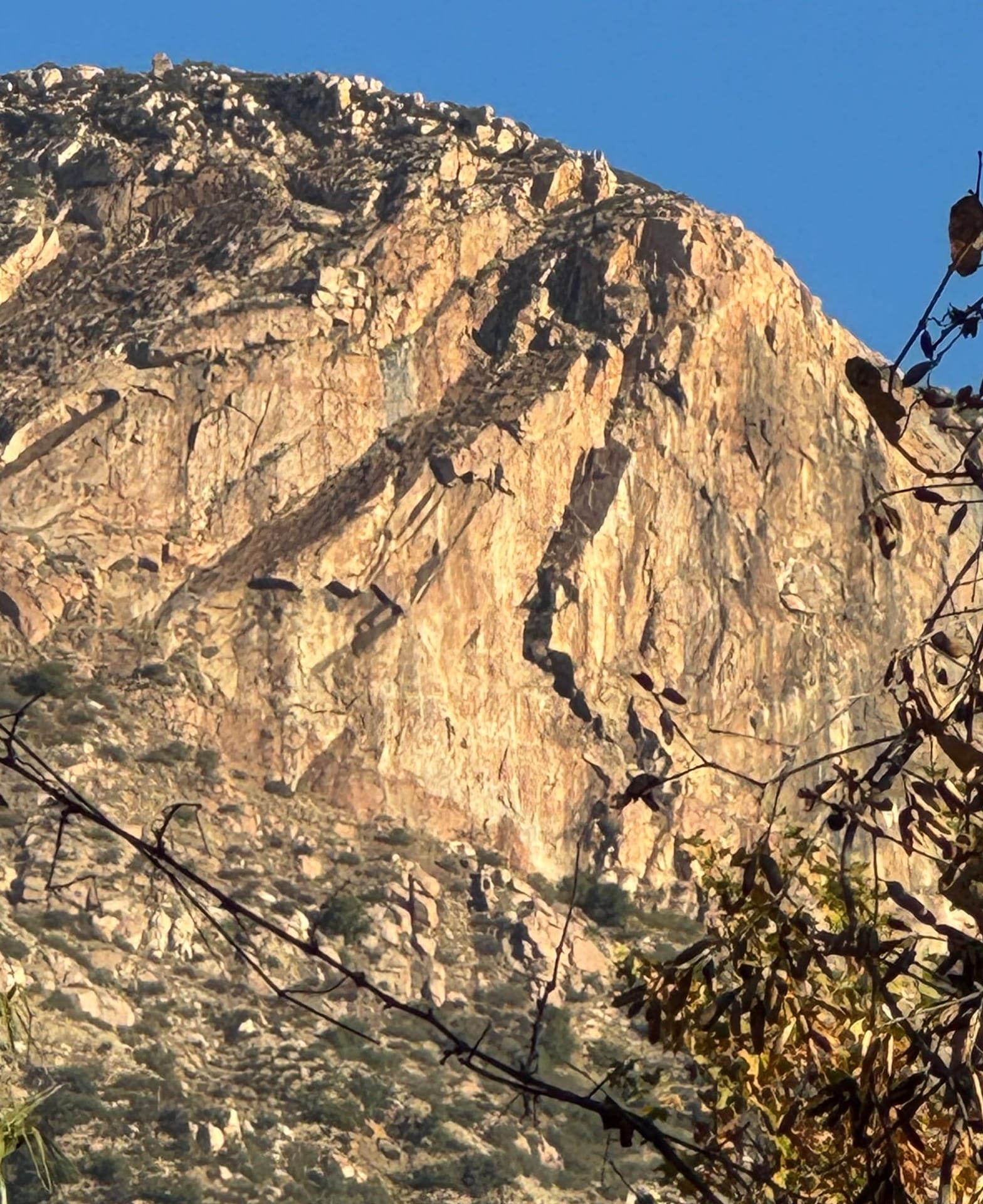
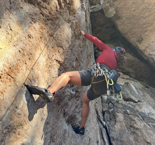
There I was, 40 feet up a granite wall, fingers gripping a crimp no larger than the side of an Iphone, legs burning as I struggled to find footholds, and one very enthusiastic Katie grinning down at me.
In that moment, heart racing, questioning my life choices, it hit me: this is what bad UX feels like.
Confusing. Stressful. No obvious next move. Definitely not designed with me in mind.
Over the past year, climbing and UX design have oddly started to blur together in my brain. Both are about navigating problems, facing fears, and making decisions with limited information, ideally without falling to your death (or rage quitting).
So here are the 5 biggest lessons rock climbing taught me about designing great user experiences with fewer injuries.
1. The Route Should Be Intuitive Even When It’s Hard
Ever been on a climb where the route setter was clearly in a weird mood? Holds that go nowhere, dead-ends mid-route, foot placements that feel designed for spiders?
That’s how users feel when your app’s flow is confusing. Just because something is challenging doesn’t mean it has to be cryptic.
UX Tip: A good design should feel “learnable” even if it’s not instantly obvious.
Like a good climb, it should allow users to build confidence and figure it out as they go without hitting a wall of frustration.
2. Beta is Everything: Users Need Guidance
In climbing, “beta” is shorthand for the sequence of moves or tips to complete a route. Climbers share beta like designers share Figma links; generously, sometimes questionably, always passionately.
Your users need beta too.
They need subtle cues:A tooltip hereA progress bar thereA well-labeled button instead of a mysterious icon that looks like a doodle
A climber flailing on a route with no beta is like a user clicking "Next" and wondering, “Wait, what just happened?”
UX Tip: Use visual hierarchy, onboarding flows, and microcopy to act as digital beta. Help your users move confidently through your product.
3. Don’t Assume Everyone Is 6’2" With Ape Arms
Climbing routes are often unintentionally designed for tall people with massive reach. UX design is guilty of this too. Assuming every user has:
- Perfect vision
- Fast internet
- A brand new iPhone
- Prior app experience
- Two thumbs and no accessibility needs
Bad design is exclusive. Good design is adaptable.
UX Tip: Design for edge cases, test with diverse users, and never assume your experience is universal.
Your “ideal” user might not be your actual user.
(Also, short climbers are strong as hell and frequently make me feel inadequate in the gym. Respect!)
4. Iteration is the Name of the Game
No one sends their project on the first go. To "Send" a route, for those of you who don't climb, means to complete a new route without any falls or takes on the first attempt. UX design, like in climbing, means you try, you fall, you swear, you rethink your life, and then you tweak your beta.
Sound familiar?
Great UX isn’t born perfect either. It’s tested, broken, rebuilt, tested again and just like every hard climb you’ve ever projected, it's iterated over again.
UX Tip: Embrace iteration. Treat each usability test like a climbing session: a chance to fall, learn where things break down and make small, impactful improvements.
5. Falling Is Part of the Process
If you’re not falling, you’re not trying hard enough. That’s gospel in climbing.
Same goes for design.
Your first idea might suck. Your first version might confuse users. Your “brilliant” onboarding flow might lead people to a digital dead-end where they close the tab and never return.
But each failure teaches you something.
UX Tip: Build a culture of experimentation and learning. Don’t fear failure. Harness it quickly, safely, and with a helmet (metaphorically speaking).
Final Pitch: Be the Friendly Route Setter
At the end of the day, the best climbing routes and the best product experiences are made by people who care deeply about the person on the other end - your customer.
The ones who set thoughtful challenges.
The ones who remove friction, not fun.
The ones who think: “How can I make this feel awesome?”
So whether you’re designing an app or a V5 in the gym, remember:
- Don’t be confusing for the sake of being clever.
- Make things feel possible, even if they’re hard.
- Guide your users like a good climbing partner with just enough help to let them shine.
Now, if you’ll excuse me, I have a product flow to fix and a new route to project in the gym.
TLDR – UX Lessons from Climbing
- 🧭 Make flows intuitive, not mysterious
- 👀 Give subtle beta through smart UX cues
- 💪 Design for every body and user type
- 🔁 Iterate like you’re projecting a 5.12
- 😬 Embrace the fall, it’s where the learning lives
Like this? Share it with your product team or that one friend who insists climbing is just “fun with ropes.”
Want help building user experiences that don’t leave your users hanging? Reach out here. I promise not to make any more climbing puns. Probably.